
Energy Management, Monitoring & Targeting and Energy Efficiency
Energy Management, Monitoring & Targeting and Energy Efficiency brings together a curated set of informational infographics from TEAM Energy, designed to support clear understanding of Energy Management, optimising energy efficiency and M&T principles. The lookbook provides journalists and stakeholders with accessible, evidence‑based visuals that explain complex concepts, regulatory contexts and best‑practice approaches.

TEAM Energy
Infographic showing four best‑practice principles for effective energy monitoring, displayed as coloured triangular panels with icons. The principles are regular audits and surveys, employee engagement, continuous improvement, and leveraging technology such as IoT and APIs for accurate monitoring and analysis.
Credit: TEAM Energy
TEAM Energy
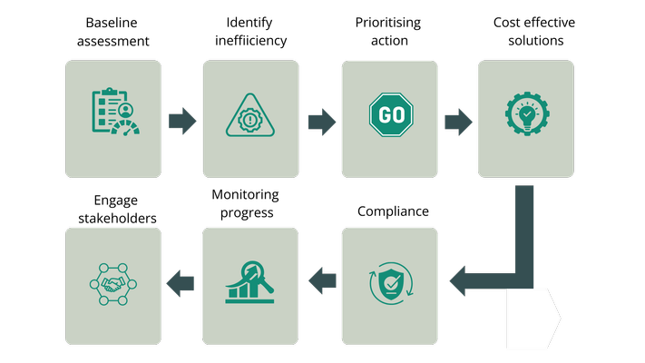
Flowchart infographic showing how an organisation can use an energy efficiency survey to support net zero plans. The process moves from baseline assessment to identifying inefficiency, prioritising action, and selecting cost‑effective solutions, followed by compliance, monitoring progress, and engaging stakeholders, shown as connected steps with arrows indicating continuous improvement.
Credit: TEAM Energy
TEAM Energy
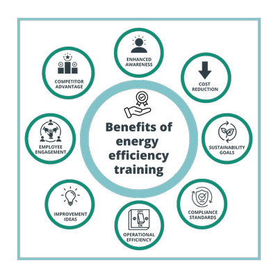
Infographic illustrating the benefits of energy efficiency training. At the centre is the title “Benefits of energy efficiency training,” surrounded by eight icons representing enhanced awareness, cost reduction, sustainability goals, compliance with standards, operational efficiency, generation of improvement ideas, employee engagement, and improved competitive advantage.
Credit: TEAM Energy
TEAM Energy
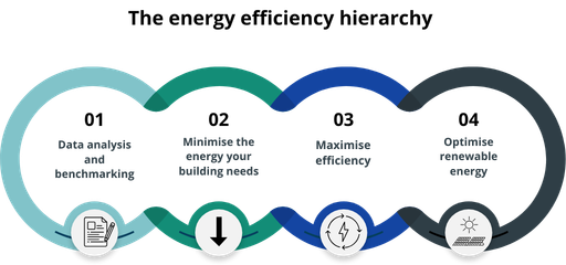
Infographic illustrating the energy efficiency hierarchy in four connected stages. Stage one focuses on data analysis and benchmarking; stage two on minimising building energy needs; stage three on maximising efficiency; and stage four on optimising renewable energy. The stages are shown as linked numbered loops with supporting icons, progressing from data and demand reduction through to renewables.
Credit: TEAM Energy

TEAM Energy
Infographic explaining why energy monitoring is important, highlighting both environmental and financial benefits. A horizontal sequence of icons illustrates six key reasons: reduced environmental impact, cost savings, improved energy efficiency, regulatory compliance, enhanced decision‑making, and cost assurance, shown in a connected timeline across a light and dark green colour palette.
Credit: TEAM Energy
TEAM Energy
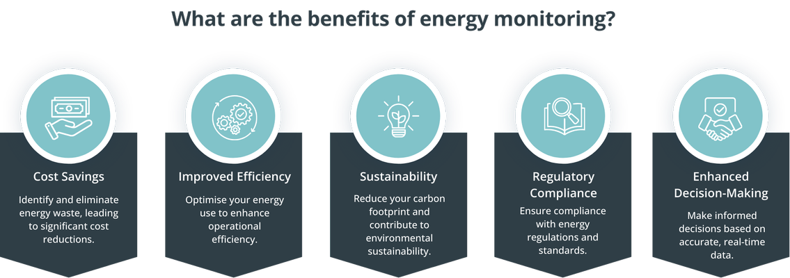
Infographic outlining the benefits of energy monitoring. Five key benefits are shown using icons and captions: cost savings through identifying and eliminating energy waste; improved efficiency by optimising energy use; sustainability through reducing carbon footprint; regulatory compliance; and enhanced decision‑making based on accurate energy data.
Credit: TEAM Energy

TEAM Energy
Circular infographic showing the energy management cycle. The cycle is divided into five connected stages: understanding energy use; planning and organisation; implementation; verification, monitoring and reporting; and company commitment, arranged around a central label reading “Energy Management Cycle.”
Credit: TEAM Energy
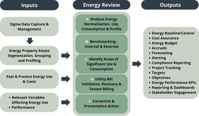
TEAM Energy
Process diagram showing the energy management process from inputs to outputs through an energy review. Inputs include data capture and management, estate segmentation and profiling, historical and current energy use and costs, and variables affecting performance. The energy review stage covers analysis of energy use, internal and external benchmarking, identifying significant energy consumption, utility bill validation and recovery, and corrective and preventative actions. Outputs include energy baselines and budgets, cost assurance, forecasting, alerts, compliance reporting, performance targets and objectives, energy KPIs, dashboards, project tracking, and stakeholder engagement.
Credit: TEAM Energy