Infographic comparing two tenants in the same building. A tenant without access to energy data receives invoices without verification, struggles with budgeting and carbon reporting, and manages costs...
Image of Rob Webb, Bureau Operations Manager at TEAM Energy. Rob oversees Tenant Billing, Energy Bureau and Power Management operations, using data-led controls to maximise accuracy and service qualit...
Infographic titled "8 Energy Data Questions Every Tenant Should Ask Before Signing a Lease," listing eight numbered questions covering energy measurement, cost allocation, consumption data, historic i...
Infographic outlining the NHS Evergreen Sustainable Supplier Assessment Service process, from gap analysis and NHS Evergreen compliance alignment to evidence pack development, sustainability action de...
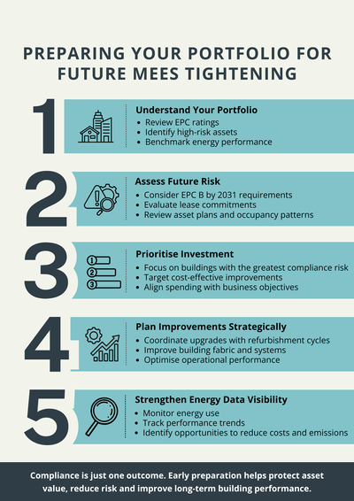
Five-step infographic on preparing a commercial property portfolio for future MEES tightening. Steps include understanding EPC ratings and high-risk assets, assessing future compliance risks, prioriti...
Image of Alex (Ka Leung) Au Yeung - Energy Consultant, BEng(Hons), MSc, CEng, MCIBSE
Alex delivers ESOS, EPCs and TM44 services, drawing on hands‑on facilities and project management experience to st...
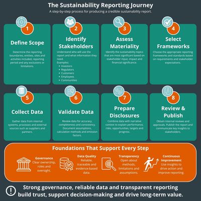
Infographic titled “The Sustainability Reporting Journey” showing an eight-step process for producing a sustainability report: Define Scope, Identify Stakeholders, Assess Materiality, Select Framework...
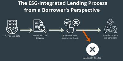
Infographic showing an ESG-integrated lending process from a borrower’s perspective. The process flows from providing ESG data, through lender ESG due diligence and a credit decision, to either loan a...
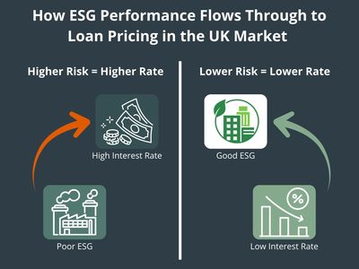
Infographic showing the relationship between ESG performance and loan pricing in the UK market. Companies with poor ESG performance are associated with higher lending risk and higher interest rates, w...
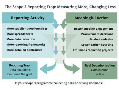
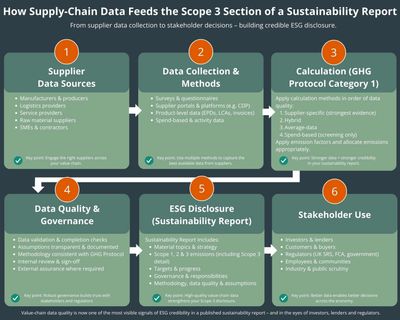
Infographic showing how supply-chain data feeds into Scope 3 sustainability reporting. The six-step process covers supplier data sources, data collection methods, emissions calculations, data quality...
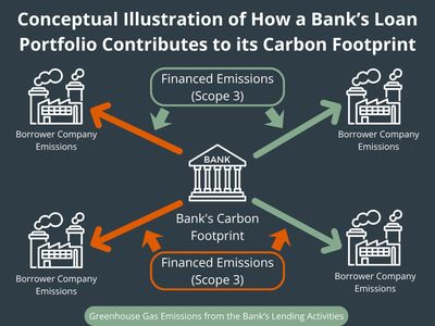
Infographic illustrating how a bank’s loan portfolio contributes to its carbon footprint through financed emissions (Scope 3). A central bank icon is connected by arrows to multiple borrower companies...
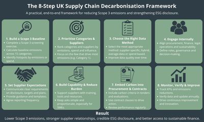
Infographic titled “The 8-Step UK Supply Chain Decarbonisation Framework” outlining a process for reducing Scope 3 emissions. The eight steps are: Build a Scope 3 Baseline, Prioritise Categories and S...
Diagram showing TEAM’s Sustainability Reporting Framework, where Sustainability Consultancy provides strategy, Sigma Carbon Reporting Software provides carbon data, and Microsoft Power BI delivers das...
Diagram showing an effective approach to Scope 3 emissions: prioritising suppliers and categories, starting with broader data coverage, targeting better data selectively, using hybrid methods, and usi...
Diagram of Scope 3 emissions categories showing 15 upstream and downstream activities, including purchased goods, business travel, product use and end‑of‑life treatment.
Infographic titled “Energy Audits – FAQs” presenting four common questions: what report is received after an audit, how often audits should be conducted, whether audits support net zero goals, and if...
Infographic outlining the benefits of an energy audit, including improved efficiency, tailored recommendations, cost savings, emissions reduction, system upgrades, enhanced reporting, equipment optimi...
Infographic illustrating how organisations use energy efficiency surveys to support Net Zero plans, showing a step-by-step process with icons for assessment, identifying issues, go/no-go decision maki...
Infographic showing ten steps to improve building performance through an energy audit, including energy consumption analysis, benchmarking, HVAC review, lighting evaluation, equipment inventory, smart...
Infographic showing common issues identified during a TM44 inspection, including obsolete air conditioning systems, refrigerant leakages, insufficient insulation, poor maintenance, and incorrect syste...