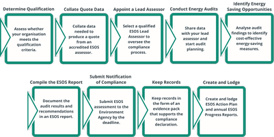
Infographic outlining the key steps for ESOS compliance, including determining qualification, collating quote data, appointing a lead assessor, conducting energy audits, identifying energy saving oppo...
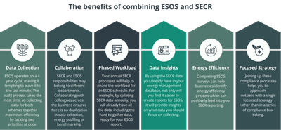
Infographic outlining the benefits of combining ESOS and SECR, including data collection efficiency, collaboration across departments, phased workload, data insights, energy efficiency improvements, a...
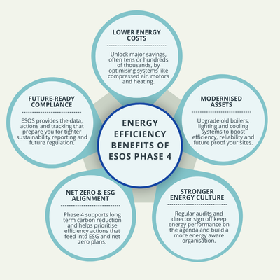
Illustration showing the energy efficiency benefits of ESOS Phase 4, including lower energy costs, modernised assets, stronger energy culture, net zero and ESG alignment, and future-ready compliance.
Image of UK university campus. Green grass lawn with curved pathway in the foreground leading to a large building with many windows in the background of the image.
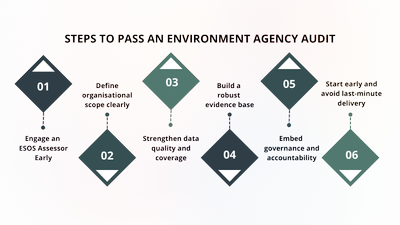
A six-step infographic titled “Steps to Pass an Environment Agency Audit.” The infographic uses diamond-shaped markers labelled 01 to 06, arranged horizontally. Each step outlines a key action: engage...
Image of Tom Anderton, Commercial Director at TEAM Energy.
Tom is a commercially astute leader with over a decade of experience across the carbon, sustainability, energy management and energy supply...
Image of Paul Dowling, Customer Success Director, TEAM Energy
Paul brings over 15 years’ experience delivering strategic value, customer success, and long‑term partnerships within the energy sector.
Image of Edward Kilby, IT Director at TEAM and EDW Group. Edward is an accomplished technology executive with over 20 years’ experience delivering transformative IT strategies and solutions within the...
Image of Tim Holman, Head of Consultancy at TEAM Energy being interviewed for a new television programme ‘UK Businesses and the Transition to Net Zero’,
Image of Tom Anderton, Commercial Director at TEAM Energy being interviewed for a new television programme ‘UK Businesses and the Transition to Net Zero’,
Circular infographic titled “What can a Commercial EPC identify?” showing five areas a commercial energy performance certificate may highlight: fabric issues such as insulation weaknesses, heating and...
Pie chart showing UK organisations’ responses on net zero target verification: 30% have verified targets, 55% have not, and 15% prefer not to say, from the Carbon Countdown survey.
Bar chart showing the main drivers for organisations’ net zero transition: corporate social responsibility, brand reputation, regulatory requirements and cost savings, based on TEAM Energy's Carbon Co...
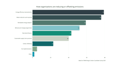
Horizontal bar chart showing how organisations are reducing or offsetting emissions.
Energy efficiency improvements (79%) and waste reduction and recycling (76%) are the most common actions, followed...
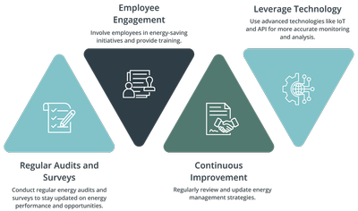
Infographic showing four best‑practice principles for effective energy monitoring, displayed as coloured triangular panels with icons. The principles are regular audits and surveys, employee engagemen...
Flowchart infographic showing how an organisation can use an energy efficiency survey to support net zero plans. The process moves from baseline assessment to identifying inefficiency, prioritising ac...
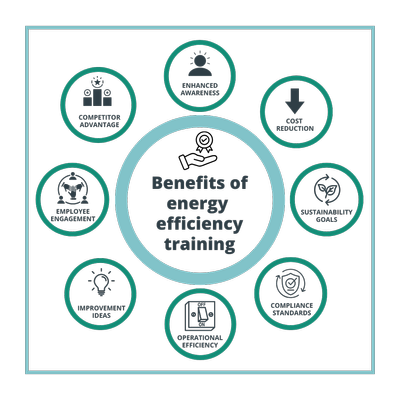
Infographic illustrating the benefits of energy efficiency training. At the centre is the title “Benefits of energy efficiency training,” surrounded by eight icons representing enhanced awareness, cos...
Infographic illustrating the energy efficiency hierarchy in four connected stages. Stage one focuses on data analysis and benchmarking; stage two on minimising building energy needs; stage three on ma...
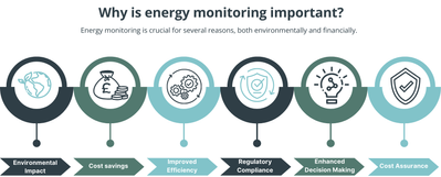
Infographic explaining why energy monitoring is important, highlighting both environmental and financial benefits. A horizontal sequence of icons illustrates six key reasons: reduced environmental imp...